Web design that works

If you work as a brand manager or digital marketer, you’ve likely heard this request more times than you can count: “I think we need a refresh.”
It’s a common and often instinctual ask. Maybe the website typography feels a little dated, the visuals echo a past era of design (check out these fun throwbacks), or the mobile experience just isn’t pulling its weight. These are valid observations, but more importantly, they’re an opportunity. It can represent a new and exciting chapter for a brand.
A successful redesign goes deeper than just visual updates. Treating it as a surface-level fix is just papering over the cracks, missing the opportunity to address the real issues. Recognising that your website, even if it’s a light-weight brochure site, is a powerful tool in communicating who you are, what you do, and how you create value is essential.
Web redesign with purpose, not just polish
When considering a site redesign, it helps to know the right sort of questions to be asking.
- What are your business goals, how does the website support them?
- Who is the website for (no, not your business, who is looking for this website)?
- What are visitors trying to achieve?
- Where do they get confused or give up?
These types of questions are rooted in UX (User Experience) thinking, and are often best answered through a combination of internal questioning, user feedback and data insights garnered from tools such as Google Analytics.
Therefore UX isn’t only about how things look. It’s about how people interact with things and the journey they go on. When it’s done well, everything else, from layout to language, falls into place.
UX principles
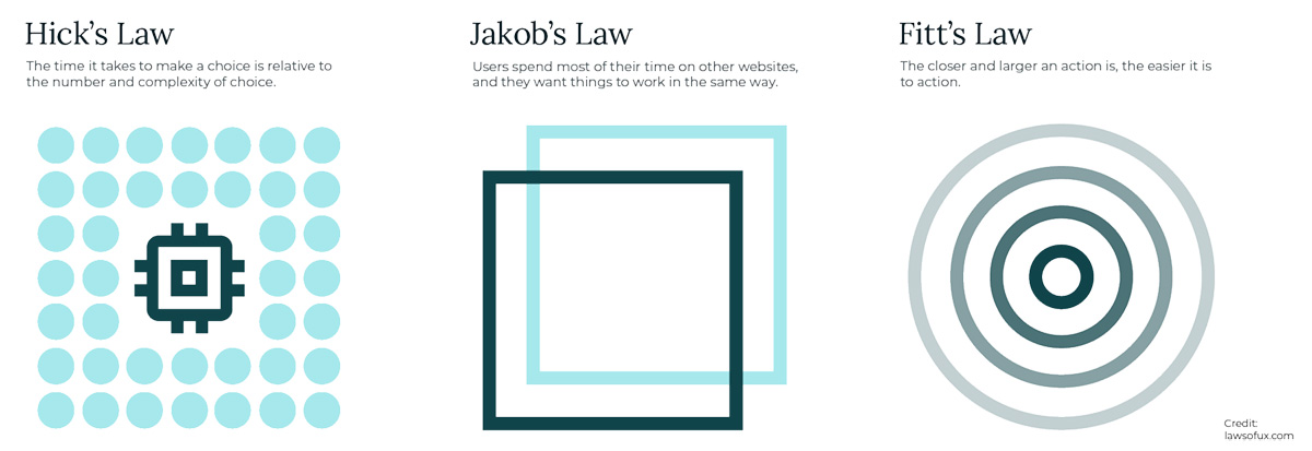
UX principles aren’t just design jargon but are fundamentals grounded in research and informed by a deep understanding of human behaviour. Therefore, once you grasp the logic behind them, you’ll start to see them applied across digital experiences everywhere. Laws of UX is a great introduction to UX principles.
While many of these principles could easily warrant a dedicated article (or several!), here are a few easy to follow insights that can quickly improve the effectiveness of a website:
1: Clarity over cleverness
Visitors will arrive at your website with a task in mind, and most people don’t want to spend their time decoding clever headlines or interacting with an unconventional navigation. They want to know what you do, how you can help, and what to do next. Clear, plain language makes that easier.
Pro tip: Replacing vague CTAs like “Let’s talk” with clear directions such as “Book a free consultation” help alleviate any moments of doubt.

2: Consistency builds confidence
When design elements change from page to page, or navigation works differently in various places, trust starts to erode. Consistency in visuals and structure helps a site feel solid and reliable.
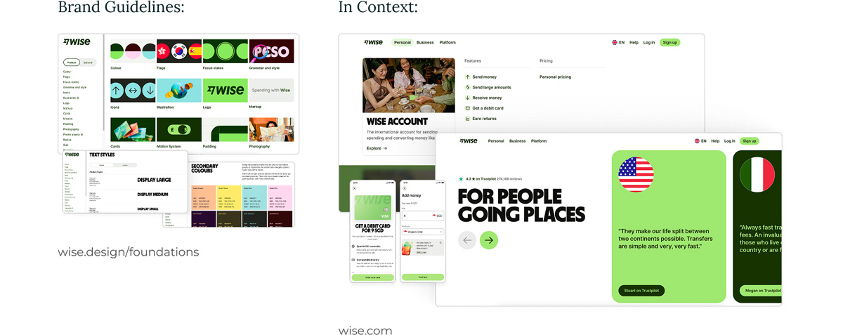
Pro tip: When starting your redesign, create a simple style guide which contains your core elements such as colours, fonts, buttons, and tone of voice and ensure this is followed across every page.
3: Avoid TL;DR - structure supports skimming
People rarely read every word, they skim. Headings, subheadings, short paragraphs, and well-placed calls to action help users find what they need quickly. Having succinct copy and a considered user journey allows users to easily access the information they want.
Pro tip: Try reading your page out loud or skimming it on your phone. If it feels unclear or confusing, break up long blocks of text and introduce some clear headings.
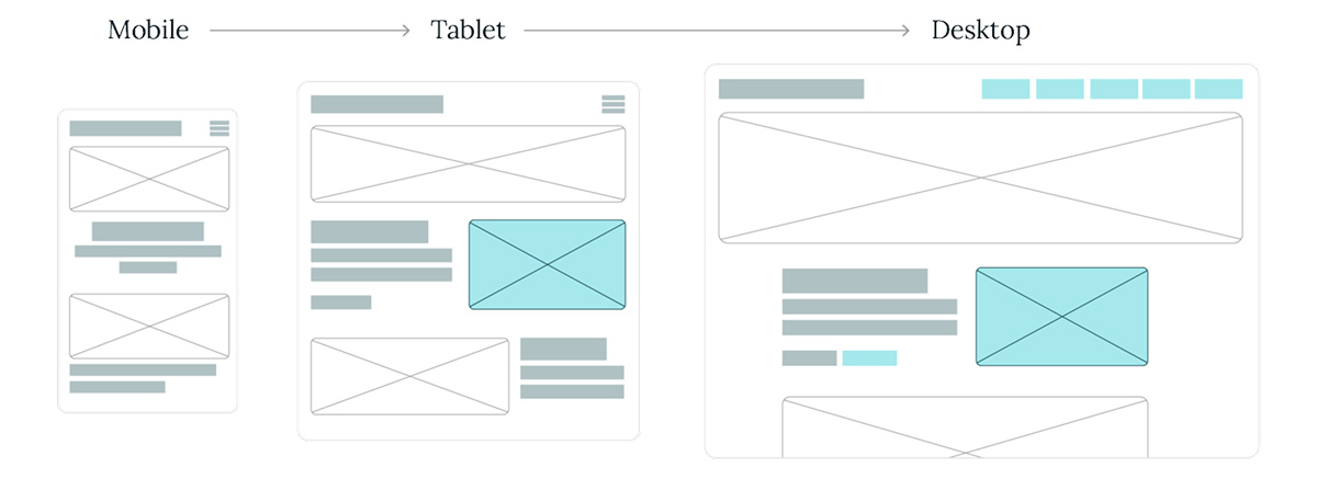
4: Mobile isn’t an afterthought
Many people will first visit your site from their phone - whether they’re on the sofa, on a train, or Googling you after a recommendation (in the UK alone, mobile traffic is over 65% of all web traffic!) Therefore, if their mobile experience feels cramped, clunky or incomplete, it gives the impression that you haven’t considered their needs. You may have heard of “mobile first design” - this philosophy, whilst we could wax lyrical, essentially ensures that you treat mobile as a priority when designing your website. It avoids responsive design feeling like a squeeze-it-in-later job and ensures your site feels welcoming, professional, and trustworthy across all devices.
Pro tip: Consider what actions you want users to take, and those they organically take, and see how they perform on mobile (things like filling out a form or finding contact details). If it feels like a fiddly, two-thumb job you may be causing frustration for your users.
5. Purpose-driven page design
Every page on a website should have a defined purpose. Whether the goal is to explain a service, encourage an enquiry, or build trust, both the design and content need to be aligned in supporting that objective. Unnecessary bloat or meandering pages are a quick-fire way to confuse users and push them away from your site.
Pro tip: Before designing any page, define its purpose in a single, focused sentence. For example “This page should help someone understand X” or “This page should guide the user to do Y”. Keep that sentence visible throughout the process. Let it guide your decisions on structure, content, and design to ensure everything contributes to the intended outcome.
Applying the principles
Now, let’s take our learnings and consider what’s really happening beneath the surface. If your refresh started with a gut instinct of “it just doesn’t feel right”, you’re probably onto something. For instance, if your homepage feels underwhelming, explore what is causing those feelings - maybe the issue isn’t visual at all. Perhaps your key messages aren’t coming through clearly or maybe your most important services aren’t getting the visibility they need. It could be that the language simply isn’t articulating your value in a compelling way.
As you begin to identify these underlying frictions, you can start to shape useful, actionable feedback that goes beyond “make it look better.”
As part of a purposeful redesign, more strategic feedback becomes increasingly helpful. Some examples are:
- “Bring primary messaging further up the page”
- “Make calls to action more visible and intuitive”
- “Simplify language that feels overly dense or technical”
Ultimately, this is a shift in focus from how a page looks to how it performs. So, when performance becomes the priority, your website evolves from a passive brand touchpoint into a tool that actively delivers value.
Avoiding the ‘New Look’ trap: a practical checklist
If you’re contemplating a redesign, these considerations can help keep your decisions purposeful and focused:
![]()
Know your users
Use analytics, user feedback, and on-site behaviour data to understand what’s working and what’s not. What are visitors struggling to find? What are they expecting when they land on your site? Real insights beat assumptions every time.
![]()
Clarify your goals
What does success look like for this redesign? More enquiries? Clearer messaging? Improved credibility? Define objectives before diving into design.
![]()
Keep what works
A redesign doesn’t mean starting from scratch. Identify what’s already performing well and build around it as retaining proven elements can help maintain familiarity and continuity for your users.
![]()
Lead with UX thinking
Start with the experience, not the aesthetics. That means focusing on structure, navigation, content clarity, and messaging hierarchy before colour palettes and typefaces come into play.
Make it work, then make it beautiful
There’s no universal formula for a successful website redesign. Creativity and innovation (especially when they challenge convention) have their place, but the most effective results often come when visual decisions are grounded in purpose.
That doesn’t mean you can’t break the rules. In fact, when done with intention, rule-breaking can lead to standout experiences. The key is ensuring every design choice aligns with your broader strategy and objectives.
So, as you approach your next project, focus on creating something that’s not only beautiful, but truly beneficial. Put your users first and let purpose drive the design.
Last updated December 2025
