What is Web Accessibility? Designing for Everyone

There are many assumptions about what disability looks like, and they are often far narrower than reality. In web design, accessibility is far broader than most people realise. It encompasses four key categories of disability, internationally recognised design principles, and a business case that is increasingly difficult to ignore.
This article explores the different types of disability, the principles that guide accessible design, and why getting it right is not just a compliance exercise, but a practical and commercial advantage for any business building for the web. The aim is simple: to reframe accessible design not as a specialist concern, but as good design practice that benefits everyone.
It’s Not Just One Thing
Disability exists on a spectrum, but it is generally understood across four broad categories:
- Visual: Ranging from full blindness through to colour blindness, low vision, and sensitivity to bright screens.
- Auditory: Encompasses full deafness, partial hearing loss, and difficulty engaging with audio-first content without supporting formats.
- Motor: Any condition affecting physical interaction with a device, including limited dexterity, tremors, or difficulty using a mouse or touchscreen accurately.
- Cognitive: Perhaps the most wide-ranging category, covering Dyslexia, ADHD, memory-related conditions, and differences in how people process and retain information.
Permanent, temporary or situational design considerations
What makes accessibility particularly relevant is that it is not limited to permanent conditions. It also includes temporary and situational barriers.
Permanent disabilities are long term or lifelong conditions. Temporary disabilities are short term, such as a broken wrist or recovering from surgery. Situational disabilities are context driven, shaped by environment or circumstance. For businesses, this significantly expands the potential audience of any website or digital product.
Take someone trying to navigate a site one handed. That could be a person with a missing limb, someone with a wrist injury, or a parent holding a sleeping baby. Different contexts, same constraint, and in each case, the same design decisions apply.
Accessible design does not just support edge cases. It reflects real world use.
Types of Disability

Permanent
Long-lasting or unchanging

Temporary
Short-term with an expectation of recovery

Situational
Caused by environment or context
The Guidelines Behind the Practice
WCAG (Web Content Accessibility Guidelines) is the internationally recognised standard for accessible web design. For businesses, it’s worth knowing about for two reasons: it underpins legal compliance, and it represents established best practices for building websites that work for everyone.
If you’ve come across the term before, you might have filed it away as something technical and not particularly relevant to you. In reality though, WCAG’s four principles are straightforward and useful to understand.
Core accessibility principles:
![]()
Perceivable
Information and user interface components must be presentable to users in ways they can perceive.
Example: Alt text for images so screen readers can describe them.
![]()
Operable
User interface components and navigation must be operable.
Example: Not everyone uses a mouse, so a well built site should work for keyboard navigation.
![]()
Understandable
Information and the operation of the user interface must be understandable.
Example: Descriptive error messages, helping the user understand how they can fix it (i.e. filling in a form).
![]()
Robust
Content must be robust enough that it can be interpreted by a wide variety of user agents, including assistive technologies.
Example: The website works across different browsers, devices, and assistive technologies.
If you want to explore WCAG in more depth, then W3C’s official documentation is a detailed starting point.
What The Principles Look Like in Practice
Principles are useful, but what does accessible design actually involve day-to-day? If you are a business owner or marketer, think of this as a checklist of items worth discussing with your designer or developer about on your next project:
- Colour contrast: Text needs to remain readable against its background. Low contrast is one of the most common accessibility failures, and one of the easiest to fix.
- Keyboard navigation: Can a user tab through your site logically without a mouse? Focus states (the visible outline around a selected element) should be clear rather than hidden.
- Alt text and labels: Images should include descriptive alt text , and form fields should have visible labels. These features support accessibility, but they also improve SEO and overall usability.
- Readable typography: Font size, line height, spacing, and typeface choice all affect readability, particularly for users with dyslexia or low vision.
- Logical heading structure: Headings are not just a visual styling tool. They create a navigational structure for screen reader users, and help search engines better understand page content.
None of these considerations require a complete redesign. In most cases, they are decisions made early in a project that add little to no additional cost when handled properly from the start.
Retrofitting accessibility later is where costs begin to increase. Design, development, and content may all need revisiting, turning relatively small improvements into much larger pieces of work. Getting these foundations right early is almost always the more efficient and cost-effective approach.
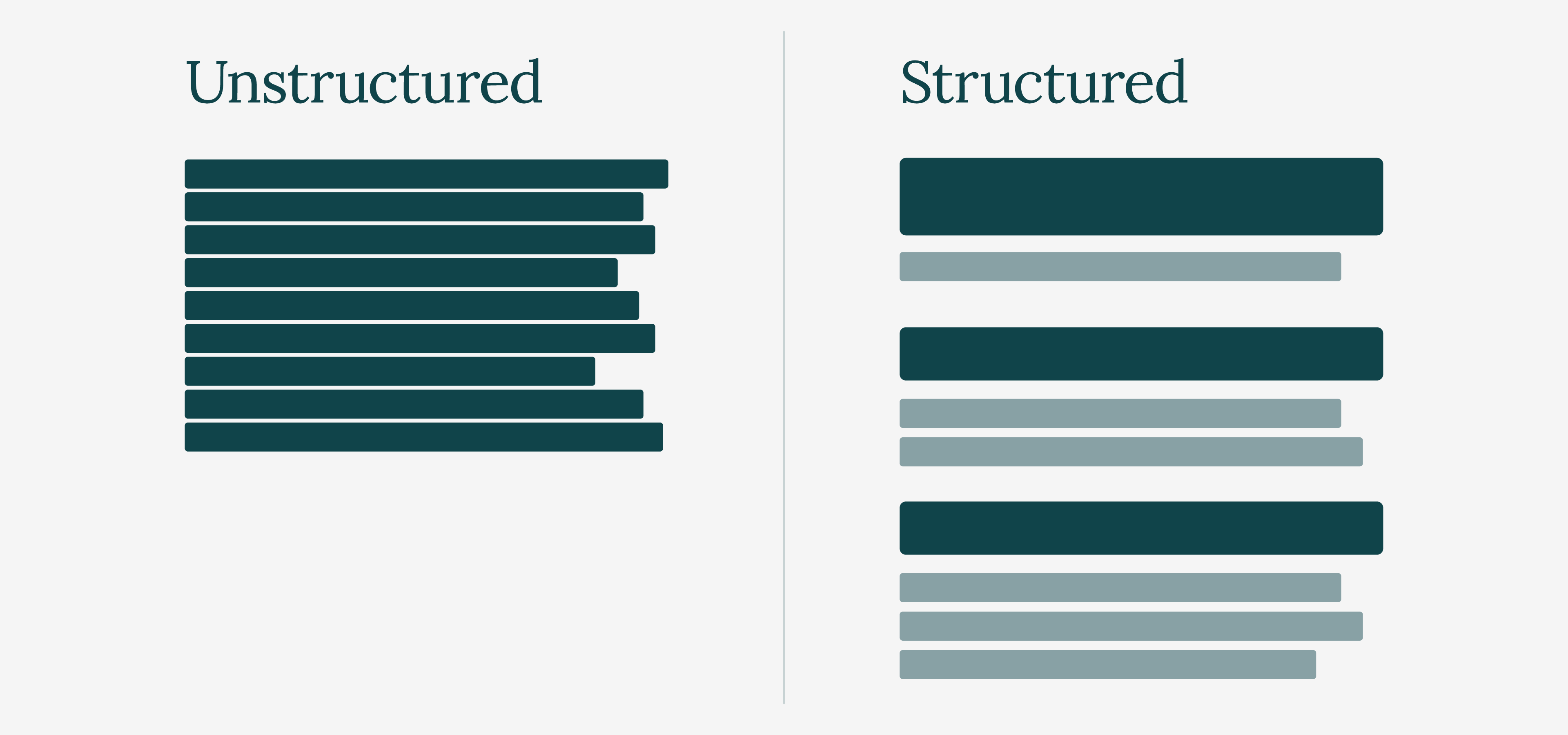
Unstructured Vs Structured Content
Accessibility, Usability, and Inclusion: What’s the difference?
These three terms are often used interchangeably, but they describe different parts of the same conversation.
Think of it as a ladder. Accessibility gets people through the door. It is the baseline, answering a fundamental question: can someone with a disability access and use this at all?
Usability is what makes the experience effective once they are there. Is the site easy to navigate? Is information clear? Can tasks be completed without confusion or frustration? A website can meet technical accessibility standards and still feel difficult to use in practice.
Inclusion sits above both. It means designing with the full range of human diversity in mind from the outset, rather than treating different needs as edge cases or afterthoughts.
The three are closely connected, but they are not interchangeable. Accessibility ensures access. Usability improves experience. Inclusion shapes the mindset behind both.
The Universal Design Pyramid

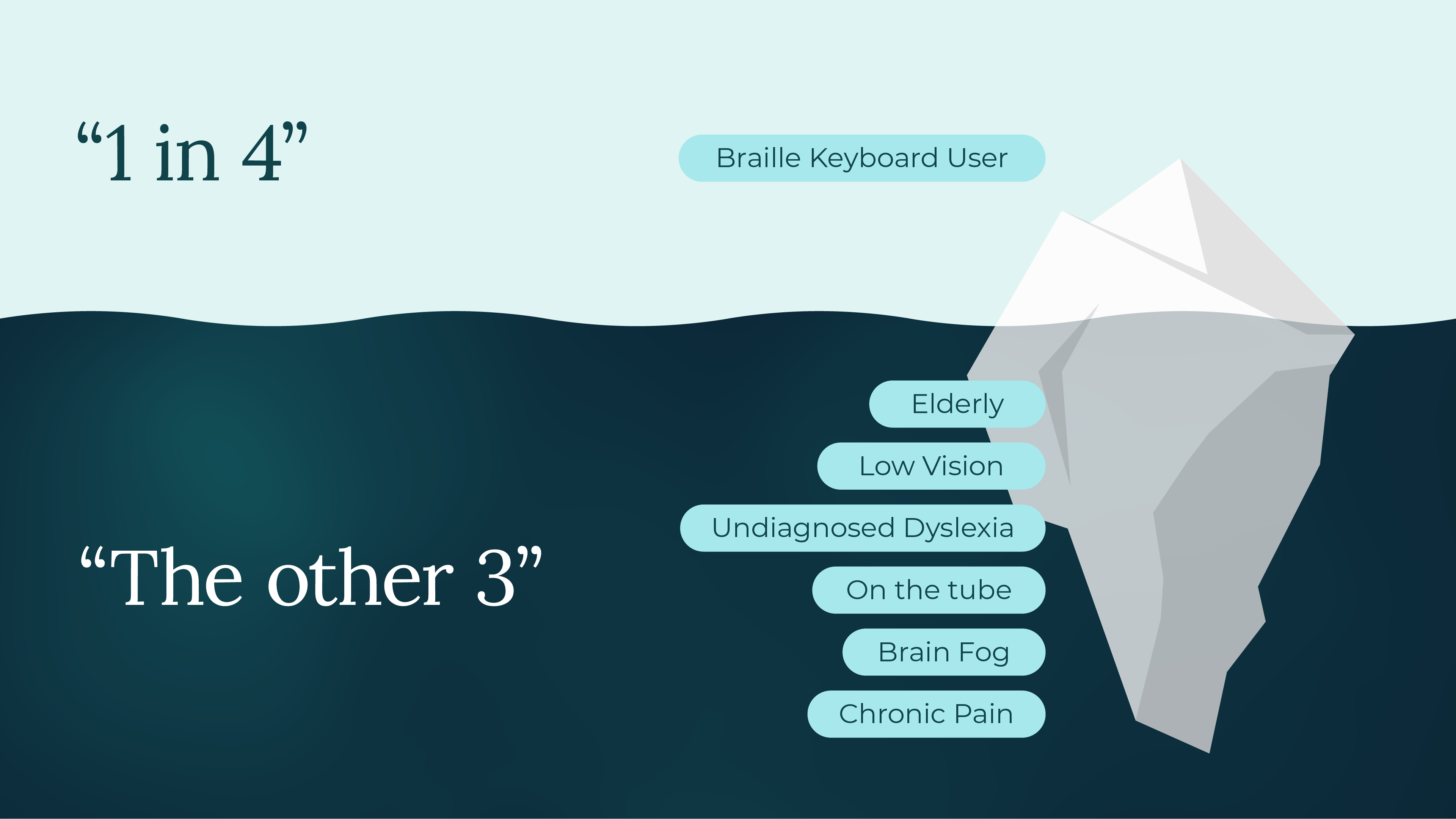
It’s Not Just About 1 in 4
You may have seen the statistic that 1 in 4 people in the UK live with a disability. That alone makes a compelling case for accessible design, but it only tells part of the story.
Many disabilities go unregistered or undiagnosed. Low vision is a good example, with countless people experiencing it without ever having it formally identified. When you also factor in temporary and situational impairments, such as someone recovering from surgery, using a phone in direct sunlight, or trying to watch content in a loud environment without headphones, the audience for accessible design begins to look a lot like everyone.
There is also a significant commercial dimension to accessibility. The spending power of disabled people and their households in the UK, often referred to as the Purple Pound, is estimated to exceed £274 billion annually.
Websites that fail to consider accessibility are not remaining neutral. They are actively excluding a substantial portion of their potential audience. For businesses, that is not just an ethical issue, but a commercial one too.
The Disability Iceberg
Good Design Includes Everyone
Accessibility can feel like a big topic, and in many ways it is, but it does not need to be tackled all at once. The most effective approach is often to start small and build from there.
Check the colour contrast on your next design, add descriptive alt text to images, and make sure headings follow a logical structure. If you are working with a designer or developer, accessibility is best raised early in the process, when decisions are easier and more cost-effective to shape.
Those small decisions add up and, over time, they stop feeling like additional steps and simply become part of how you design and build for the web.
Good design has always been about solving problems for people - and accessible design makes sure that it includes everyone.
Last updated May 2026
